SOMEONE I KNOW
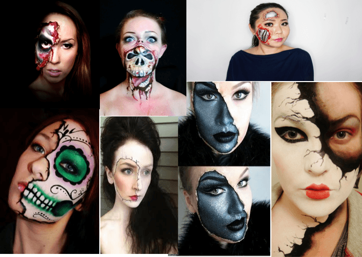
After creating my self portrait, I felt like the theme I was using was a strong one to continue with. I like the message of hiding behind masks whether it be literally or figuratively. After making it look like I was wearing a mask that was wearing off, I wanted to reverse that idea. Meaning the same, but showing real skin splitting and revealing another mask under that one. Perhaps suggesting that despite us all looking very similar, we all have an inner demon say, that we cover up to ‘fit in’ with todays societies and expectations.
For this image I used my boyfriend Kieron, as he’s probably the most comfortable person around me. I looked at images online and photographers that have worked with disguise in their images. In my head, I had an image of something people use for halloween costuming so created a moodboard of ideas to get a firm grasp of how I wanted the subject to look.
CONTACT SHEETS
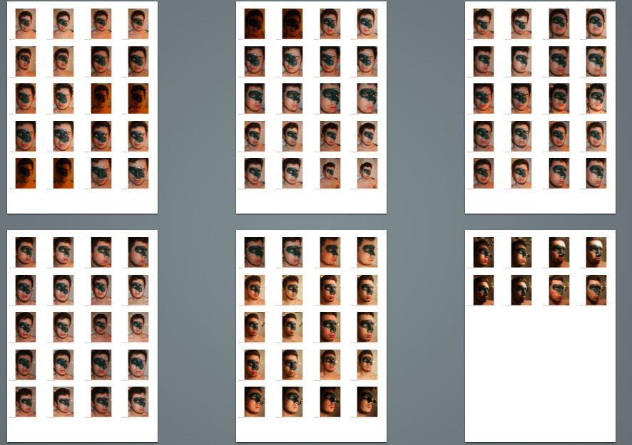
Once I had an idea about how I was going to paint my subject, I positioned him using several different lighting techniques on a plain wooden backdrop. I knew when editing that the background wouldn’t matter as I’d already planned on making all the portrait backgrounds black. However, I needed something plain and simple to prevent any focus detracting from my subject. I was interested in experimenting with lighting like in my self portrait one. I liked the side profile a lot and wanted to also experiment with angles of the face, which would bring out the paint the best way, tell the best story etc.
When painting my subject, I didn’t use anything to copy as I had an image set in my mind. Most of the successful face paints of this nature use things other than paint, for example they use special material that is glued onto the face to make it look like the skin is peeling off. I didn’t have this sort of luxury so had to use what I had. In this case, a set of acrylic paints. I am not an artist at all, and am fully aware that I cannot paint or draw but I’ve always enjoyed doing it and I refused to do a photo of someone I know just sat looking into the camera with a spotlight on their face. So, I took many different photos as you can see in the contact sheets.
SELECTION PROCESS
After taking the photos, I did the usual process of selecting 5/6 that I think are strong images and selecting it down to the final one i will use and edit.
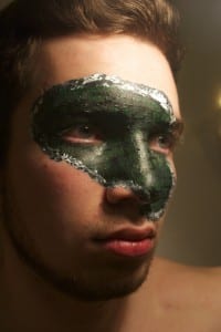
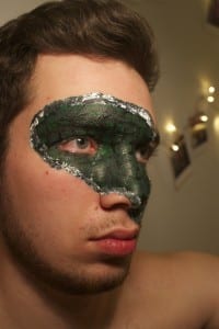
This is one of the images I selected as I like the way the light falls onto Kieron’s face from the right. I feel like this image allows the green mask to become vivid and appealing to the audience. However, I don’t like how the eyes are out of focus. The edges of the face are soft and therefore not engaging. The message I’m trying to portray needs to have a strong eye focus and overall image focus. This is why I didn’t choose this photo as my final portrait image.
Another one of my favourite photos. I liked the interesting lighting on this shot as it was a high angle spot light I used. Again, my struggle with this was getting the photos to be the centre of focus. I think this had something to do with the fact that there was so much detail on the face that it focused around the eyes instead of the pupil. As previously said, this was not something I liked for this project as I knew it was important as an audience to have that focus to the eye in order to gain a physical connection with the subject. The eyes are what we first see as people and behind the eyes is a story. If they’re not in focus, this story is blurred and impossible to read.
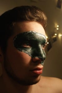
The focus of the eyes is better in this image but I’m not a fan of the lighting. I didn’t want the lighting to be too harsh on the entire face and that’s how it looks on this image. I decided by this point that I liked the side angle and wanted my final image to be of this. I placed the image in the left third of the frame as I wanted it to look like he was looking longingly into the distance. This allows the audience to become intrigued and therefore connected to the subject.
This was a close second in my decision making. I loved the lighting that just hits the subjects forehead as it makes the right side of his face dark and allows there to be an element of mystery to the overall image. My only issue with this image is that the right eye is very hard to make out. I toyed with the idea of how this could be effective but I felt strongly about at least one of the eyes being in focus. The colours of this image are also quite distorted which I don’t like. I knew I could edit this is Photoshop but I felt like I’d taken better that captured all of the elements I wanted to include.
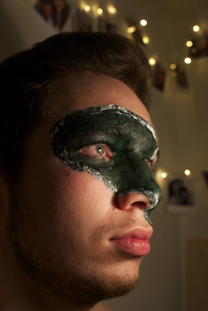
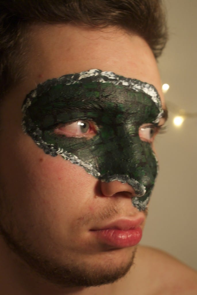
This is the image I chose to use for my final image. I feel like that low angle shot makes the subject seem more powerful over the audience. The positioning of his face also suggests power and dominance. The lighting creates shadow of the left side of the face but allows mystery and excitement. The eye we can see is well focused and lit. I wanted the subject to have the light reflection it his eye to show that he’s looking at something in the distance, telling a story to the audience. The green paint looks well lit and I think quite realistic. As we know, the overall theme to my portraiture is the fact that we all wear masks everyday in order to be someone else. Whether that be to protect the real us, or to please the society we live in. I think this final image is a beautiful way of portraying that message. For the editing, I knew I needed to get rid of the background and make sure the entire photo is crisp with it’s focus, brightness etc.
EDITING
The editing of my portrait was quite complex. I began by adjusting basic things on Photoshop like brightness, contrast, saturation etc. I then used the paint tool to allow my subject to be on a black background. I got rid of his shoulders to make it look like it’s a mask turned to the side. I then duplicated the background layer and adjusted it’s hue. This made the mask part of the face more green and blue to allow it to stand out more. However, This made the skin colour turn green, which I didn’t like.
To avoid this alien looking image, I duplicated the layer again and made that layer’s hue sepia tone. I then adjusted the layers in the layers panel to make the skin tone an old fashioned brown colour which allowed the green under mask to stand out an extreme amount.
FINAL IMAGE
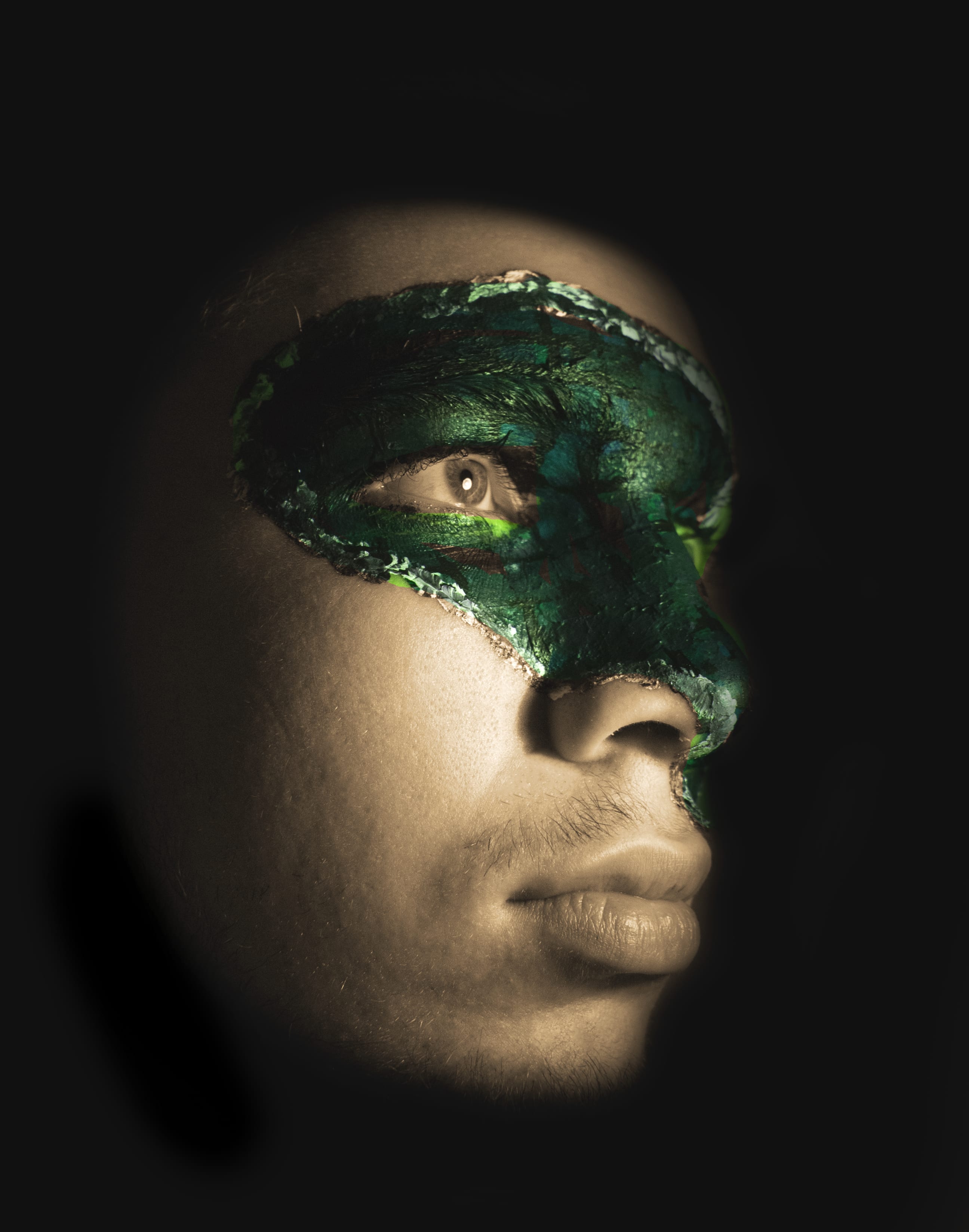
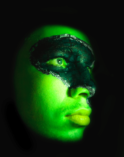
I’m really pleased with the final portrait for someone I know. I feel like it captures my overall message well, showing the fake skin peeling off and revealing another creature. I chose the colour green because I think it’s a colour we, as humans, avoid. Green connotes jealousy and disgust. However, green can also connote nature and health. I liked the contrast in ideas as this allows the audience to make their own mind up about what the alter ego is underneath his everyday skin. I like the composition of the image, having the eye in the centre of the frame with the left side of the face fading into darkness. I think there’s something very uncomfortable about the photograph but overall very effective for the message I’m trying to get across.
Leave a comment