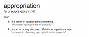
Right, we’ve been given our first task- which is to create 3 photographs that show appropriation. I had absolutely no idea what that word meant but after doing a bit of research and expanding on my lecture notes, I have developed a pretty clear understanding of it. So, it’s dictionary definition is…
When this is put into photography, you actually find some pretty awesome stuff that people have done. The idea of putting photos together to create a different meaning was something I’d not done before. I’ve always had an interest in people photography and how a photograph tells a story so was looking to use this interest amongst my experimentation with this project.
So, I looked into the names given in the lecture so I could get a feel for their work. I began with Richard Prince who we briefly touched upon during the lecture, focusing primarily on his instagram photos.
MOODBOARD
Appropriation photo 1
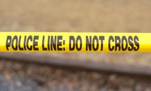
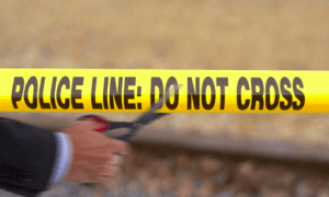
When deciding what I should do for my appropriation photos, I liked the idea of having a theme. As we were told to create 3 images, I felt like a theme would compliment each of them and bring the appropriation together. When deciding what theme i wanted to present, I decided to go for ‘crossing the line’ – the term ‘crossing the line’ can mean several different things, but my interpretation of this is danger, trouble, mischief. If I was about to cross the line at home, it would mean I’d annoyed my parents enough for them to almost flip… Around us, we are constantly reminded of that boundary.. Police tape, a yellow line at a train station reminding us to not step over it and many more that we as humans, fail to notice on an everyday basis. So to begin this theme, I looked into the ideas that came into my head, not so much how they’ve previously been appropriated but the photos that I could use to create new meaning. Firstly, I wanted to stick with something slightly simple in terms of the editing just to allow me to have a photo that was simply put together but had a strong message. It was this reasoning as to why I chose a police tape photo from google with a photo of a man cutting a line of ribbon, also from google.
Putting these two images together was simple, the idea was to make it look as though the man was cutting the police line, as though he is choosing the break the rules, society ignores police orders, the act of rebellion etc – all of these thoughts come to mind when looking at the image. I used Photoshop to layer the photos on top of each other and then simply used the rubber tool to put the hands and scissors onto the police photo. I then blurred the hands to lose some identity and add an effect to the overall photo. The final image is as follows…
I think the photo is effective and straight forward which is exactly what I wanted for the first attempt at appropriation. However, it’s far too simple for the kind of photography I enjoy so for the next photo I plan to use Photoshop more and use some of my own photos and have a go at appropriating some of them!
Appropriation photo 2
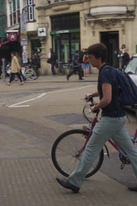
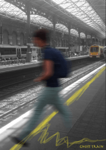
After a simple approach to appropriation, I decided to do something slightly more artistic. I have chosen to use two of my images taken from Oxford and London (two of my closest cities). Throughout my life, I have been specifically interested in street photography, of people, places and things. Here we have a photo of a man walking with his bike in the centre of Oxford city. It was an action shot taken in the middle of summer last year. I decided to also look at another photo i took of Euston train station in London. With the theme of crossing the lines in mind, I remembered the yellow line at a train station where my mum and dad would tell me to never cross the yellow line and out of rebellion i would always go put a toe over it.. Yeah well, this came into mind. And despite people probably never admitting it, I often have a ‘what if’ moment at a train station. What if I fell in and couldn’t get back up, what if I jumped just at the perfect time in front of that ridiculously fast train… So i wanted to create an image that made people think… what if.

To Photoshop the two together, I placed the man into the train station photo. I then used the eraser tool to rub out all the background and get rid of the mans bike. By this point I had decided to make it look as though the man is either about to jump in front, or has already jumped in front and we as people have forgotten that people do often choose this as a state of suicide. With this in mind, I positioned the man as he was crossing the dreaded yellow line. I think desaturated the photo to make only the yellow of the line and the train have colour. I think used the pain tool to roughly draw over the yellow line and then paint it downwards to create a heartbeat image with it going flat at the end, as though the heart has stopped on a heart monitor. I then blurred the man to show speed but also the possibility that he is in fact a ghost… hence the name Ghost Train.
I really think this image is strong and effective. It certainly puts two images together to create a different meaning which after all is the point of appropriation. I could improve this by making the heartbeat slightly more recognisable as it’s not exactly clear. It’s important in photography to create images that people recognise so that they can relate and empathise accordingly.
Appropriation photo 3
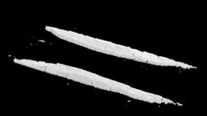
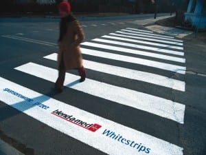
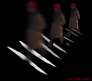
For the final image for the appropriation project, I wanted to do another photo of ‘crossing the line’ but for this one I had the initial idea of law breaking yet still having a physical line that is being crossed. I thought about a line of cocaine as this is something physically in a line but also against the law. When thinking of how to put this into an image, I liked the idea of working with the cocaine lines being a zebra crossing with someone walking over them. This took a lot of tedious editing as I will explain after showing you the original images I worked with…
To achieve this, I cloned the images of the cocaine lines and duplicated several lines behind them, as if it was a zebra crossing. I made each of them smaller and smaller to add perspective to the photo. After this, I added a new layer (the man walking) and erased his surroundings so it was just him walking. I made him bigger and put him over the last line. I was happy with this image but once I thought about it, I felt like I needed to make the destruction of drugs more obvious. To do this, I decided to copy the man twice so there were 3 images of the man walking. The furthest image of the man was clear, and as they got closer to the camera, further over the lines of cocaine, the man became blurry. I wanted to portray the idea that drugs slowly destroy a human and the further this man ‘crossed the line’, the more he faded into nothingness. I simply used the blur filter to create this effect. The title for this image came from what most addicts say to themselves ‘Just one more’ – despite knowing full well that it can never really be the end once you’re in that vicious cycle.
